Game Updates
-
#BringBackConfirmationPopUp
Same here, I accidentally clicked the complete immediately on my stadium page. I always click twice per day, first to complete the current update and after that to start the next one. This time I shouldn't have clicked twice because the new update started with the first click

-
why not building historic tournaments as champion cup 2010. it is really boring all players are 26 years old on historic tournaments.
-
@koningco I know that feel


-
@jonnypt2001 said in Game Updates:
#BringBackConfirmationPopUp
+1
Just clicked accidentally to buy a player for which I was short less than a million and I wasted 40+coins. Terrible feeling... And It was totally unneccesary player, bought him just for resell purposes
-
Just one note regarding latest Android App update (got it yesterday). It has a big problem that I cannot remove info that I bought some player that appears down middle on the screen when you buy a player. I have to click 5-6 times on that blue thing to remove it... Annoying as hell.
-
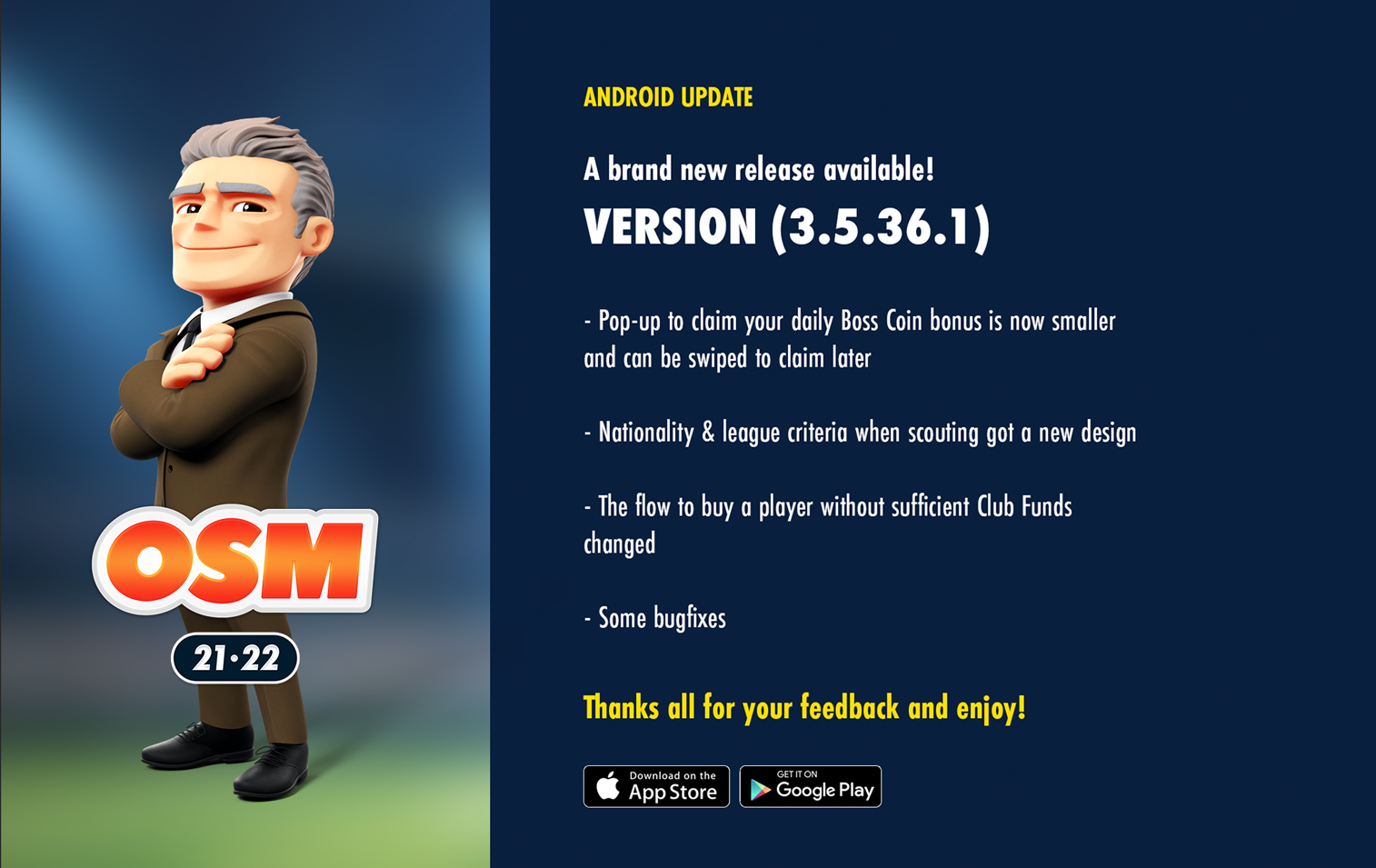
Android App Updated
OSM Android v3.5.36.1 has been released today to all our Google PlayStore users (it was progressive, so some users got it earlier). The alternative stores will follow soon.
WHAT'S NEW ON THIS VERSION?
- Pop-up to claim your daily Boss Coin Bonus is now smaller and can be swiped to claim later
- Nationality & league criteria when scouting got a new design
- The flow to buy a player without sufficient Club Funds changed
- Some bug fixes
Thanks all for your feedback and enjoy!
-
@majstor-matt said in Game Updates:
Just one note regarding latest Android App update (got it yesterday). It has a big problem that I cannot remove info that I bought some player that appears down middle on the screen when you buy a player. I have to click 5-6 times on that blue thing to remove it... Annoying as hell.
Tks for your feedback, forwarded it to be looked at

-
@specialone said in Game Updates:
@majstor-matt said in Game Updates:
Just one note regarding latest Android App update (got it yesterday). It has a big problem that I cannot remove info that I bought some player that appears down middle on the screen when you buy a player. I have to click 5-6 times on that blue thing to remove it... Annoying as hell.
Tks for your feedback, forwarded it to be looked at
We've implemented the option to swipe it away. Have you tried swiping it?
We believe that when you tap on it to remove, you may be swiping a little bit only and not enough to remove it.
-
@specialone Yup, works easilly that way. Thanks for checking it.
")
-
can anyone give me a promo code?
-
-
The new team selection screen is horrendously bad, Why make something worse than what it was?
-
@jakethesnake12345
Agreed. Unnecessary and ugly looking change.. Step closer to that horrendous skins we saw in some community surveys. Those things looked like they came out of a 10yr old design workshopHopefully It will stop at this..
-
This post is deleted!
-
Do the developers read the forums?
Please fire your UI designer!
The game becomes terrible to play.I've been an active player since 2009, lived through that "great redesign", but now it simply hurts my eyes to look at the team selection screen. I seriously start thinking to quit.
-
The team selection screen is simply terrible. Now I am close to have to use a magnifying glass to look for the physical condition and morale of my players.
Keep it simple guys. Stop changing what is good.
-
@souljinho Totally agree that it hurts your eyes to look at the new team selection screen. Also impossible to see what level of fitness the players have. I'll give it to the end of the current season and will seriously considering quitting if its still the same
-
@jakethesnake12345 That is truly sad. Given how much free space you have on the screen, giving only a few pixels for an important feature as fitness/morale - is a UI/UX crime.
-
Thanks for the feedback on the new Line-up screen everyone! I've discussed this with our UI/UX experts and fitness and morale bars are indeed a bit on the small side on some resolutions. We're going to see if we can fix this!
-
@harry-poon The training icon is also small on the line-up page. I barely can't see which players are in still training and can't play.
