Game Updates
-
@specialone said in Game Updates:
@majstor-matt said in Game Updates:
Just one note regarding latest Android App update (got it yesterday). It has a big problem that I cannot remove info that I bought some player that appears down middle on the screen when you buy a player. I have to click 5-6 times on that blue thing to remove it... Annoying as hell.
Tks for your feedback, forwarded it to be looked at

We've implemented the option to swipe it away. Have you tried swiping it?
We believe that when you tap on it to remove, you may be swiping a little bit only and not enough to remove it.
@specialone Yup, works easilly that way. Thanks for checking it.

-
@jakethesnake12345
Agreed. Unnecessary and ugly looking change.. Step closer to that horrendous skins we saw in some community surveys. Those things looked like they came out of a 10yr old design workshop
Hopefully It will stop at this..
-
This post is deleted!
-
The team selection screen is simply terrible. Now I am close to have to use a magnifying glass to look for the physical condition and morale of my players.
Keep it simple guys. Stop changing what is good.
-
Thanks for the feedback on the new Line-up screen everyone! I've discussed this with our UI/UX experts and fitness and morale bars are indeed a bit on the small side on some resolutions. We're going to see if we can fix this!
-
Thanks for the feedback on the new Line-up screen everyone! I've discussed this with our UI/UX experts and fitness and morale bars are indeed a bit on the small side on some resolutions. We're going to see if we can fix this!
@harry-poon The training icon is also small on the line-up page. I barely can't see which players are in still training and can't play.
-
Thanks for the feedback on the new Line-up screen everyone! I've discussed this with our UI/UX experts and fitness and morale bars are indeed a bit on the small side on some resolutions. We're going to see if we can fix this!
@harry-poon One more addition that I just noticed, when I have a player with 9 attack and 113 defending, the new view is so compact that this mentions 9113. This looks like one number for defenders, goalkeepers. Surprisingly for an attacker with 101 attack and 16 defense these numbers are well separated. Midfielder views are also not the best, but better than defenders or goalkeepers.
I use the web version of OSM.
-
ANDROID APP UPDATED
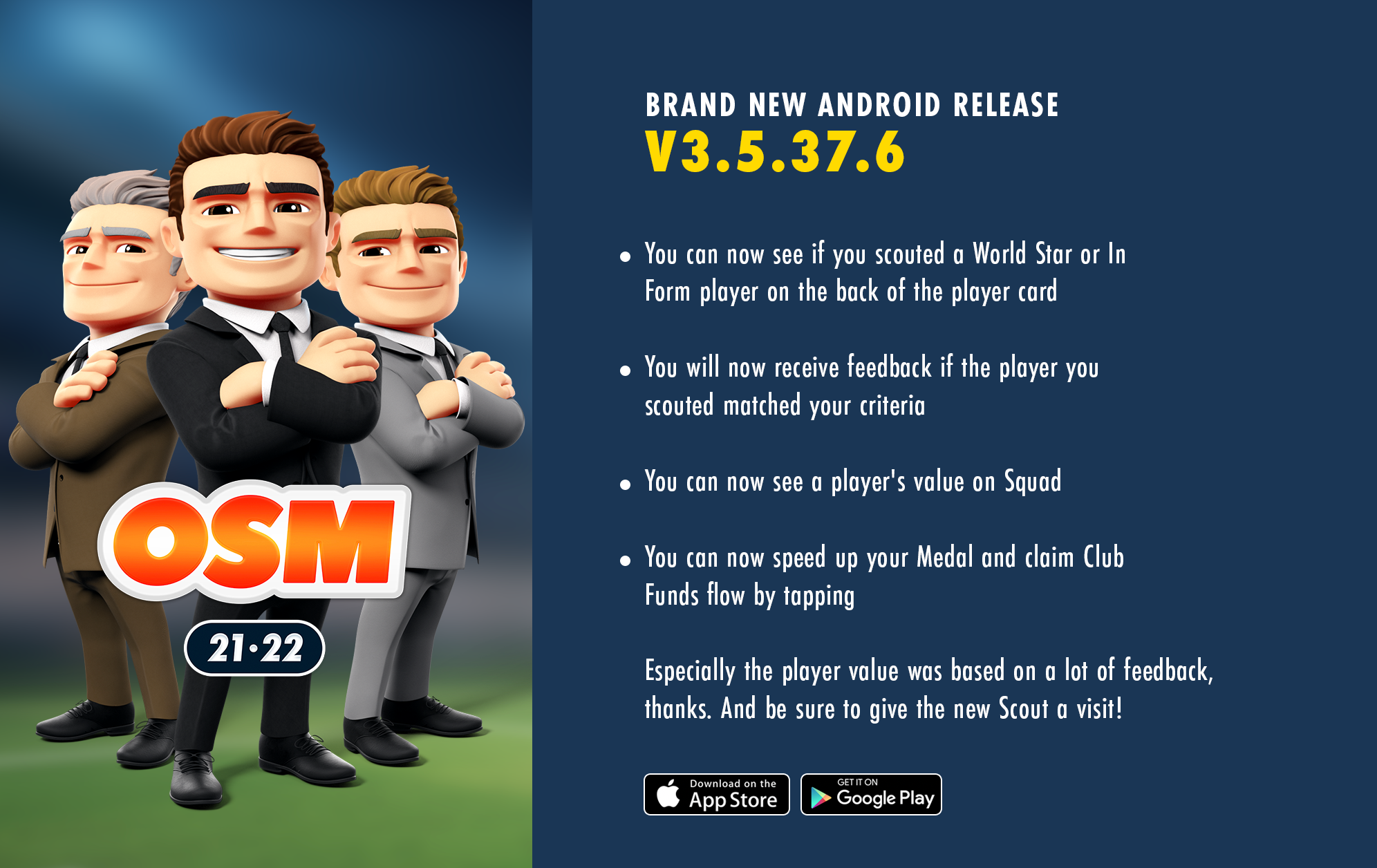
OSM Android v3.5.37.6 has been released today to all our Google PlayStore users (it was progressive, so some users got it earlier). The alternative stores will follow soon.
WHAT'S NEW ON THIS VERSION?
- You can now see if you scouted a World Star or In Form player on the back of the player card
- You will now receive feedback if the player you scouted matched your criteria
- You can now see a player's value on Squad
- You can now speed up your Medal and claim Club Funds flow by tapping
- You can now set new search criteria after the scout has finished
- You'll now have an error message when trying to add a second link of same social network
- Lineup toggles now also include text
- When scrolling on the transfer list, toolbar stays on screen
- Improved the flow when adding a player to the lineup who is in training
- Fixed some bugs
Especially the player value was based on a lot of feedback, thanks. And be sure to give the new Scout a visit!

@specialone
Price on squad is cool, but would be awesome If we could see goals and assist instead Just as they can see it on IoS If I am not mistaken.
 -
Tactics update!
Live on iOS and Android between 4-6 January
For the real tactical masterminds:
- You can see exact values when adjusting Style, Pressind and Tempo at your Tactics.
- New Tactics design: Tackling is shown with Doerak's help.
- You can see the exact number of Club Funds you'll gain when expanding your capacity at your Stadium.
- For Android: adding Friends (Friends list).
Enjoy!
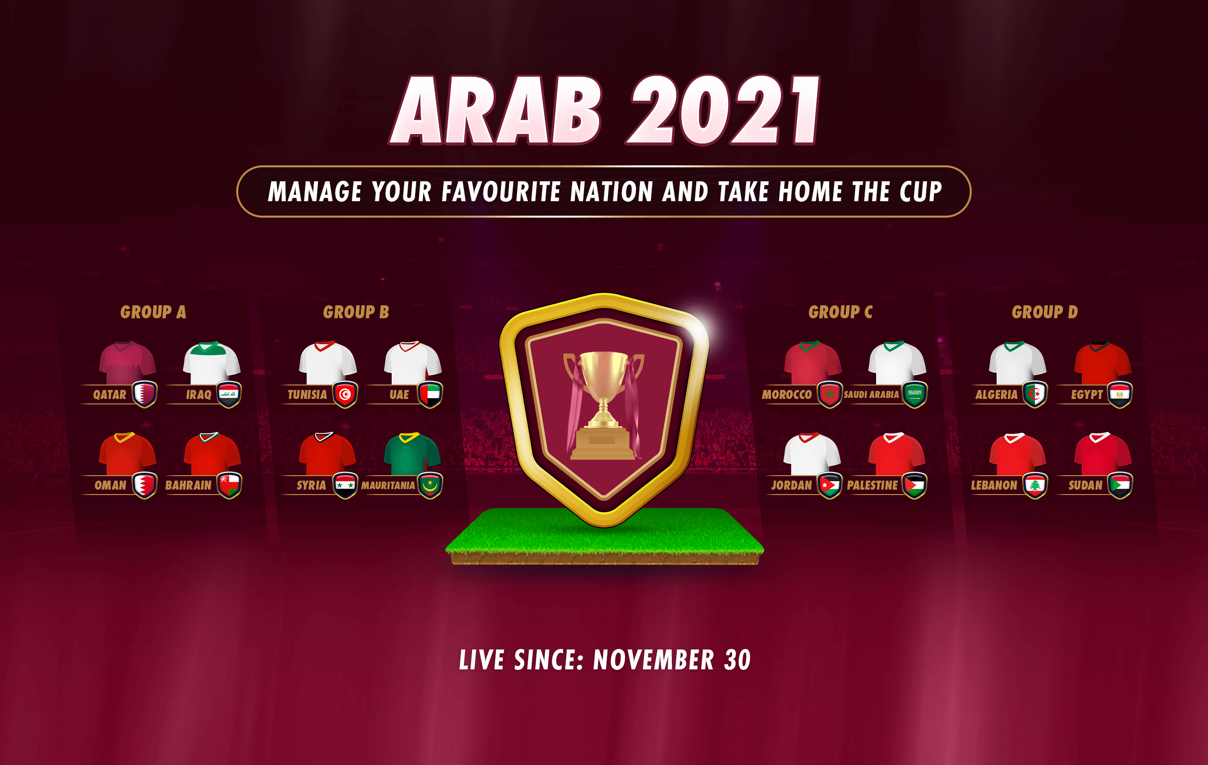
NEW TOURNAMENT: ARAB 2021

New in OSM but also in the world: Arab 2021. This Tournament is played for the first time in football history and the competition is fierce.
All the big countries are representing and bringing a mix of top and domestic players. Can you win Arab 2021 with your favourite country?
Show us, your Friends and yourself you're up for the task. Good luck!
-
Will new formations that are often used in football (3421, 4321, 4141, 3412) be introduced and finally eliminate formations that are almost never or never used (631, 334, 3232, 325, 523, 424)?
-
Will new formations that are often used in football (3421, 4321, 4141, 3412) be introduced and finally eliminate formations that are almost never or never used (631, 334, 3232, 325, 523, 424)?
@ado-hackovic said in Game Updates:
Will new formations that are often used in football (3421, 4321, 4141, 3412) be introduced and finally eliminate formations that are almost never or never used (631, 334, 3232, 325, 523, 424)?
New formations could shuffle the competition a bit and introduce new factors into the games!

However, you mention formations that are widely used like the 523 (325 and 424 are very rare to face). ️
️ -
@harry-poon One more addition that I just noticed, when I have a player with 9 attack and 113 defending, the new view is so compact that this mentions 9113. This looks like one number for defenders, goalkeepers. Surprisingly for an attacker with 101 attack and 16 defense these numbers are well separated. Midfielder views are also not the best, but better than defenders or goalkeepers.
I use the web version of OSM.
@koningco said in Game Updates:
@harry-poon One more addition that I just noticed, when I have a player with 9 attack and 113 defending, the new view is so compact that this mentions 9113. This looks like one number for defenders, goalkeepers. Surprisingly for an attacker with 101 attack and 16 defense these numbers are well separated. Midfielder views are also not the best, but better than defenders or goalkeepers.
I use the web version of OSM.
Is this still under investigation? I see no difference with 3 weeks ago.
-
@koningco said in Game Updates:
@harry-poon One more addition that I just noticed, when I have a player with 9 attack and 113 defending, the new view is so compact that this mentions 9113. This looks like one number for defenders, goalkeepers. Surprisingly for an attacker with 101 attack and 16 defense these numbers are well separated. Midfielder views are also not the best, but better than defenders or goalkeepers.
I use the web version of OSM.
Is this still under investigation? I see no difference with 3 weeks ago.
@koningco I am completely with you, my dear brother
-
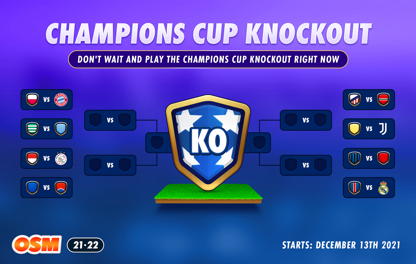
Champions Cup Knockout
 ️
️What a draw! We're all looking forward to the start of the Champions Cup in February. But why not play right now?
The fixtures are done, clubs are ready and the players can't wait. That's why we're launching the Champions Cup Knockout 2021 in OSM right now!
Pick a team and lead them to Champions Cup victory!
-
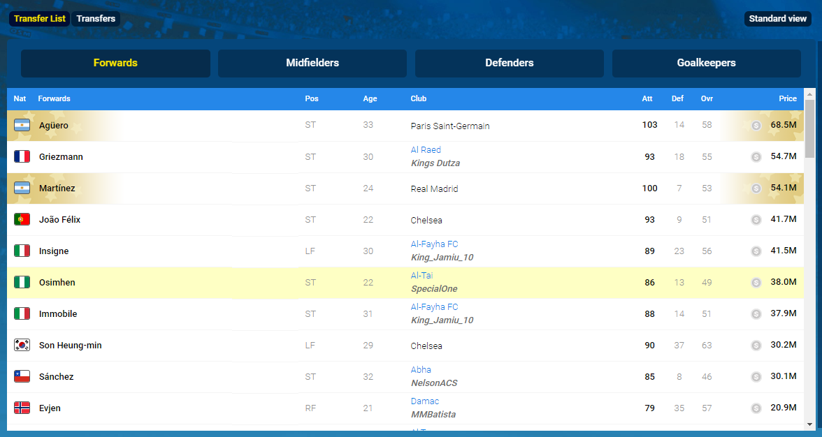
What happened with the transferlist layout design? This is terrible... I can barelly see which player is from the league of my own now.. Also italic letters, for real? Who thought that was good for eyes? -_-
-
What happened with the transferlist layout design? This is terrible... I can barelly see which player is from the league of my own now.. Also italic letters, for real? Who thought that was good for eyes? -_-
@majstor-matt @Odegaardarsenal In which version? PC? Mobile? ios/Android App?
And why do you say it's terrible? Can't it just be because manager name is Italic, right?
-
@majstor-matt @Odegaardarsenal In which version? PC? Mobile? ios/Android App?
And why do you say it's terrible? Can't it just be because manager name is Italic, right?
@specialone
For me league table with manager and club names is ok...
Everything on transfer list is bad...flags too..on PC...web version. -
I found this image on forum... don't have any

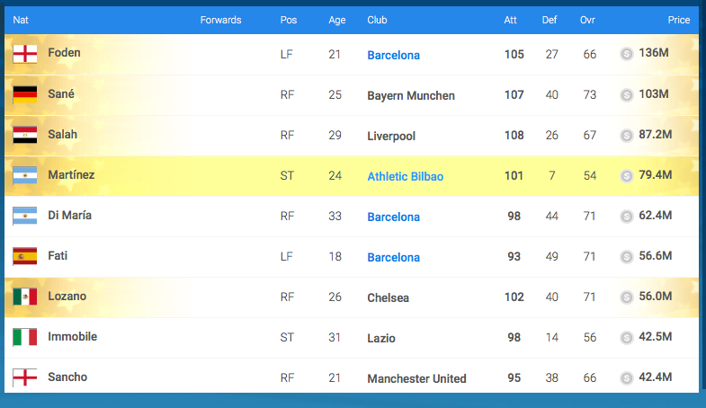
So, you guys are saying that above look is good and this one is terrible:
