Game Updates
-
@harry-poon One more addition that I just noticed, when I have a player with 9 attack and 113 defending, the new view is so compact that this mentions 9113. This looks like one number for defenders, goalkeepers. Surprisingly for an attacker with 101 attack and 16 defense these numbers are well separated. Midfielder views are also not the best, but better than defenders or goalkeepers.
I use the web version of OSM.
@koningco said in Game Updates:
@harry-poon One more addition that I just noticed, when I have a player with 9 attack and 113 defending, the new view is so compact that this mentions 9113. This looks like one number for defenders, goalkeepers. Surprisingly for an attacker with 101 attack and 16 defense these numbers are well separated. Midfielder views are also not the best, but better than defenders or goalkeepers.
I use the web version of OSM.
Is this still under investigation? I see no difference with 3 weeks ago.
-
@koningco said in Game Updates:
@harry-poon One more addition that I just noticed, when I have a player with 9 attack and 113 defending, the new view is so compact that this mentions 9113. This looks like one number for defenders, goalkeepers. Surprisingly for an attacker with 101 attack and 16 defense these numbers are well separated. Midfielder views are also not the best, but better than defenders or goalkeepers.
I use the web version of OSM.
Is this still under investigation? I see no difference with 3 weeks ago.
@koningco I am completely with you, my dear brother
-
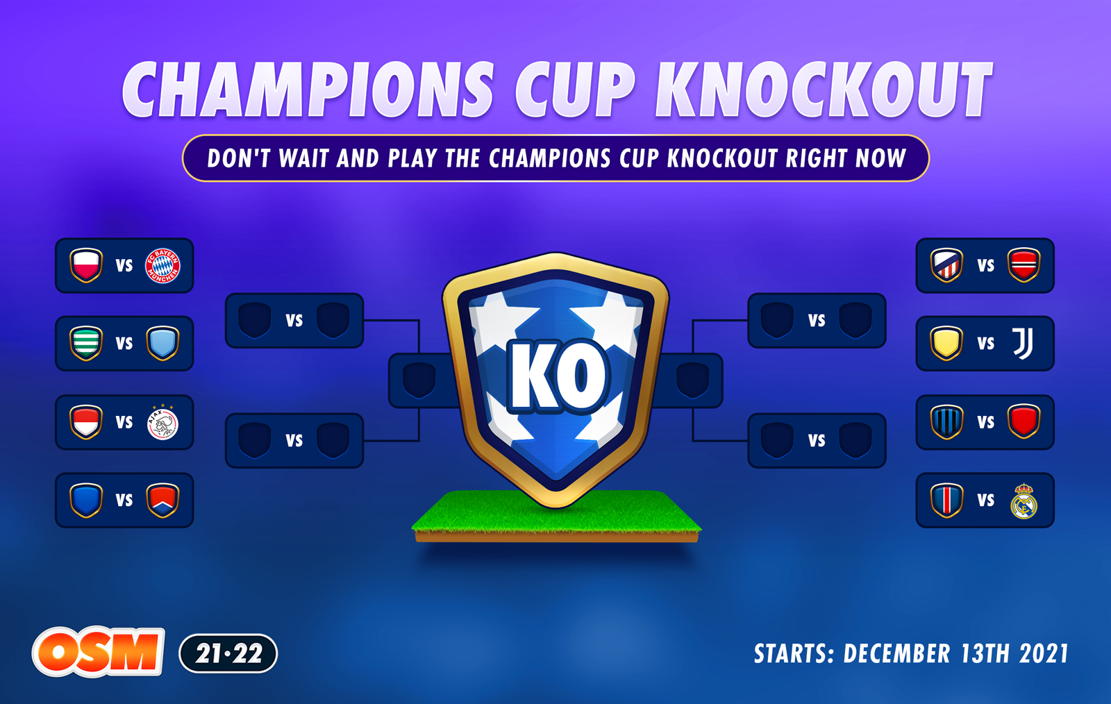
Champions Cup Knockout
 ️
️What a draw! We're all looking forward to the start of the Champions Cup in February. But why not play right now?
The fixtures are done, clubs are ready and the players can't wait. That's why we're launching the Champions Cup Knockout 2021 in OSM right now!
Pick a team and lead them to Champions Cup victory!
-
What happened with the transferlist layout design? This is terrible... I can barelly see which player is from the league of my own now.. Also italic letters, for real? Who thought that was good for eyes? -_-

🥉 OSM World Nations Cup 2021 - 3rd place (Croatia)
Crew: Proud to be Croat -
What happened with the transferlist layout design? This is terrible... I can barelly see which player is from the league of my own now.. Also italic letters, for real? Who thought that was good for eyes? -_-
@majstor-matt @Odegaardarsenal In which version? PC? Mobile? ios/Android App?
And why do you say it's terrible? Can't it just be because manager name is Italic, right?
"Success is not final, failure is not fatal: it is the courage to continue that counts." --Winston Churchill
-
@majstor-matt @Odegaardarsenal In which version? PC? Mobile? ios/Android App?
And why do you say it's terrible? Can't it just be because manager name is Italic, right?
-
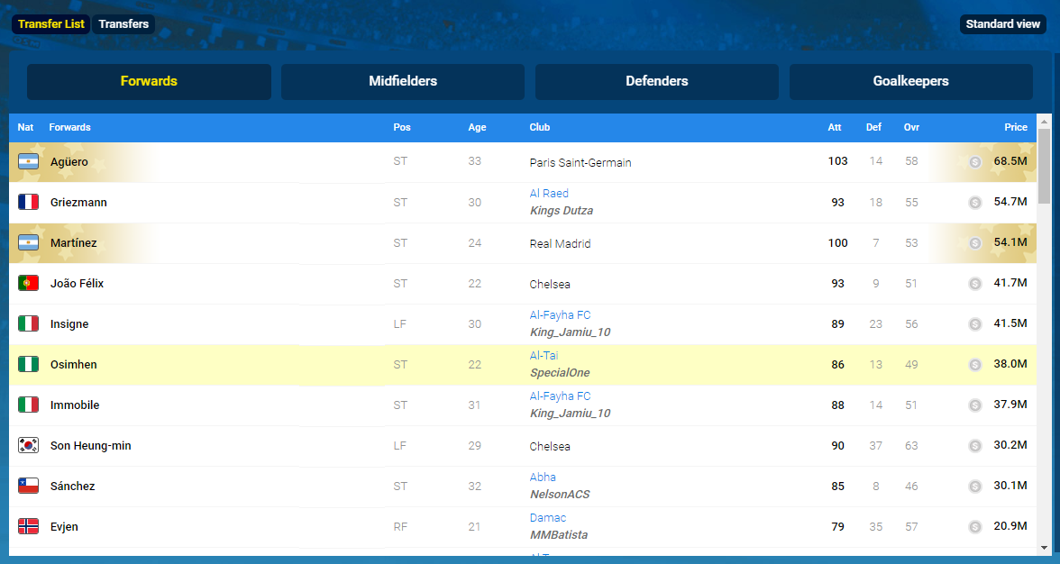
I found this image on forum... don't have any

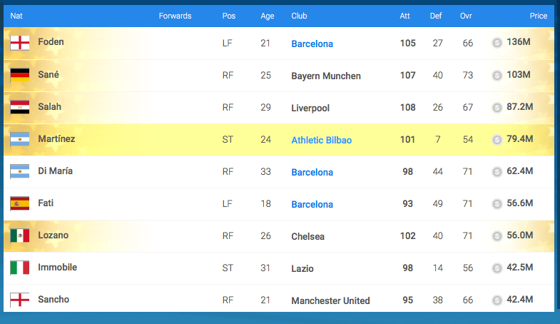
So, you guys are saying that above look is good and this one is terrible:
-
Yes, for me the 1st pic is much better...but that's only my opinion.
(de gustibus non est disputandum)@menagerbl In my opinion, I prefer the first picture because it is much better
-
New graphic update is atrocious. No idea why would anyone in dev team think this looks great. Horrible UX/UI, outdated colors, fonts, flags, this all just feels like 2005. Even old OFM had better graphics. If you needed player's review on this, this is one. Whenever I log in, and see that horrible lineup page and transfers page, I just want to leave ASAP. Cheers
Edit: It's web/PC version of game. Small italic font on transfer list doesn't help at all. Note - Why would flags on transfer list appear to be in cartoon effect, while those on Squad page are just fine as they are. Lineup graphics could be bigger.
@danteus Yes, that's right, my friend
-
New graphic update is atrocious. No idea why would anyone in dev team think this looks great. Horrible UX/UI, outdated colors, fonts, flags, this all just feels like 2005. Even old OFM had better graphics. If you needed player's review on this, this is one. Whenever I log in, and see that horrible lineup page and transfers page, I just want to leave ASAP. Cheers
Edit: It's web/PC version of game. Small italic font on transfer list doesn't help at all. Note - Why would flags on transfer list appear to be in cartoon effect, while those on Squad page are just fine as they are. Lineup graphics could be bigger.
@danteus said in Game Updates:
New graphic update is atrocious. No idea why would anyone in dev team think this looks great. Horrible UX/UI, outdated colors, fonts, flags, this all just feels like 2005. Even old OFM had better graphics. If you needed player's review on this, this is one. Whenever I log in, and see that horrible lineup page and transfers page, I just want to leave ASAP. Cheers
Edit: It's web/PC version of game. Small italic font on transfer list doesn't help at all. Note - Why would flags on transfer list appear to be in cartoon effect, while those on Squad page are just fine as they are. Lineup graphics could be bigger.
@SpecialOne To not repeat what has been said, here Danteus has said everything. Specially about flags. And yea, I would argue more on the Italic letters, simply atrocious.
Also club names were so much better in bold.Massive step back in my opinion, literally 10 years in the past.
🥉 OSM World Nations Cup 2021 - 3rd place (Croatia)
Crew: Proud to be Croat -
@danteus said in Game Updates:
New graphic update is atrocious. No idea why would anyone in dev team think this looks great. Horrible UX/UI, outdated colors, fonts, flags, this all just feels like 2005. Even old OFM had better graphics. If you needed player's review on this, this is one. Whenever I log in, and see that horrible lineup page and transfers page, I just want to leave ASAP. Cheers
Edit: It's web/PC version of game. Small italic font on transfer list doesn't help at all. Note - Why would flags on transfer list appear to be in cartoon effect, while those on Squad page are just fine as they are. Lineup graphics could be bigger.
@SpecialOne To not repeat what has been said, here Danteus has said everything. Specially about flags. And yea, I would argue more on the Italic letters, simply atrocious.
Also club names were so much better in bold.Massive step back in my opinion, literally 10 years in the past.
@majstor-matt Yes, I know. But it was only my opinion
-
@imrkon mate a majority of the players voted for boss coins to be switched off in battles so battles are fair to everyone, Having them on kills the game for everyone
-
🥉 OSM World Nations Cup 2021 - 3rd place (Croatia)
Crew: Proud to be Croat -
And here we go. Update of the atrocius font live for Android app. Every visit to the transfer list becomes double longer as I have to check twice If I am buying from PC or from a Manager in the league...

🥉 OSM World Nations Cup 2021 - 3rd place (Croatia)
Crew: Proud to be Croat -
And here we go. Update of the atrocius font live for Android app. Every visit to the transfer list becomes double longer as I have to check twice If I am buying from PC or from a Manager in the league...
@majstor-matt Hahahahaha sadly the same thing happens to me!
 From that last update it is very uncomfortable to buy players, it took me much longer! Could you highlight the manager's name with some color? In order to better distinguish if it is a computer team or a real manager! Thanks a lot!
 -
Thanks for the feedback on the new look and feel of the Transfer List everyone. We've discussed the feedback internally and looking for a fix. Hopefully we can release one next year.
-
Thanks for the feedback on the new look and feel of the Transfer List everyone. We've discussed the feedback internally and looking for a fix. Hopefully we can release one next year.
@harry-poon Please fix the match order page as well. Player skills still look like 16100 when they have 16 attack and 100 defense.
-
@harry-poon Please fix the match order page as well. Player skills still look like 16100 when they have 16 attack and 100 defense.