Game Updates
-
This whole process of setting up the user generated content filtering is taking a lot longer than we expected/predicted.
We're using an exteral software for this and not everything is managed by us, so we've to rely on others...We're sorry for this

Note: I can only suggest that if you really need to share some important info that's being filtered, just make a sceenshot and share it (you can use ShareX or Lightshot for that, both have free and fast methods to upload the images)
-
This whole process of setting up the user generated content filtering is taking a lot longer than we expected/predicted.
We're using an exteral software for this and not everything is managed by us, so we've to rely on others...We're sorry for this

Note: I can only suggest that if you really need to share some important info that's being filtered, just make a sceenshot and share it (you can use ShareX or Lightshot for that, both have free and fast methods to upload the images)
@SpecialOne I hope this is not the mainbusiness of the vendor.

-
This whole process of setting up the user generated content filtering is taking a lot longer than we expected/predicted.
We're using an exteral software for this and not everything is managed by us, so we've to rely on others...We're sorry for this

Note: I can only suggest that if you really need to share some important info that's being filtered, just make a sceenshot and share it (you can use ShareX or Lightshot for that, both have free and fast methods to upload the images)
-
375 coins for winning a knockout royale? Hahaha you guys are the best businessmen ever..
-
375 coins for winning a knockout royale? Hahaha you guys are the best businessmen ever..
-
@Caiu_77 But the transfer rate and number of opponents stay the same, so you need to waste same amount on transfer and stuff. Stonks indeed


-
375 coins for winning a knockout royale? Hahaha you guys are the best businessmen ever..
@Majstor-Matt Yeah this is a joke at first I thought it was only the entry fee that has been reduced but in the end it is both the entry fee and reward,
wow the OSM admins are very intelligent

I was even about to resign to join the knockout royale
 but I saw the legendary @Majstor-Matt post. Thank you Majstor Matt
 -

Why did you do is? Managers spend al least 200 coins on transfers, friendly marches, training camps...
-

Why did you do is? Managers spend al least 200 coins on transfers, friendly marches, training camps...
-
@SpecialOne I hope this is not the mainbusiness of the vendor.

@MarkusRW5 True! It is really difficult to communicate using the OSM chat.
-
Dear,
During the last few days my slot 1 training timer is at 4 hours and the other slots at 8 hours. I notice a significant difference in the transfer volume in Slot 1 (much higher) than the other slots. Talked to colleagues, they reported reduced timers, but in different SLOTS. What is happening? -
Dear,
During the last few days my slot 1 training timer is at 4 hours and the other slots at 8 hours. I notice a significant difference in the transfer volume in Slot 1 (much higher) than the other slots. Talked to colleagues, they reported reduced timers, but in different SLOTS. What is happening?@Daniel-Rausis you bought the super-duper-power-gold-sponsor-package?
-
@MarkusRW5 Not at all. I don't use real money in OSM, just for the record, it continues with reduced training in SLOT 1.
-
@MarkusRW5 Not at all. I don't use real money in OSM, just for the record, it continues with reduced training in SLOT 1.
@Daniel-Rausis in another thread, there was mentioned, that this is a current test.
-
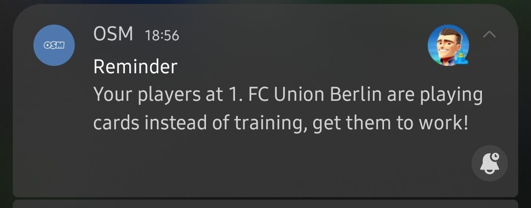
Anyone else annoyed by getting this notification dozen times per day?

-
Anyone else annoyed by getting this notification dozen times per day?

@Majstor-Matt honestly, one of the most useful things that have been implemented in recent times

-
Anyone else annoyed by getting this notification dozen times per day?

@Majstor-Matt And were your players training or not?
-
@Majstor-Matt And were your players training or not?
@SpecialOne I Play in tournament where transfer and training is not allowed... and I get this "reminder" 10 times per day (or even more) really I know that they are not in training... same like I make training in morning (about 8 morning, it is finish 16) and not start another training before simulation (about 21:30) and again this "reminder" coaming too many times
-
@Majstor-Matt And were your players training or not?
@SpecialOne said in Game Updates:
@Majstor-Matt And were your players training or not?
They were not, but there was a reason for that. Just as @jasiuk88 said.
-
@SpecialOne said in Game Updates:
@Majstor-Matt And were your players training or not?
They were not, but there was a reason for that. Just as @jasiuk88 said.
@Majstor-Matt
Getting a notification read isn't hard to do


